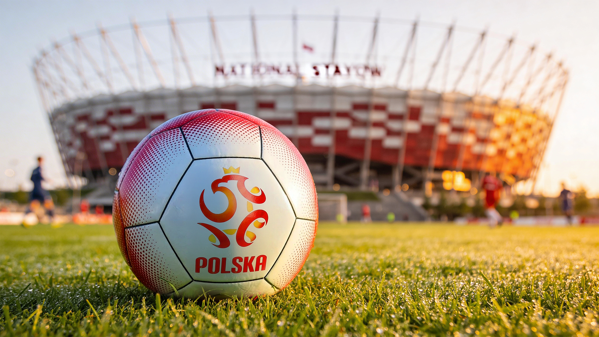
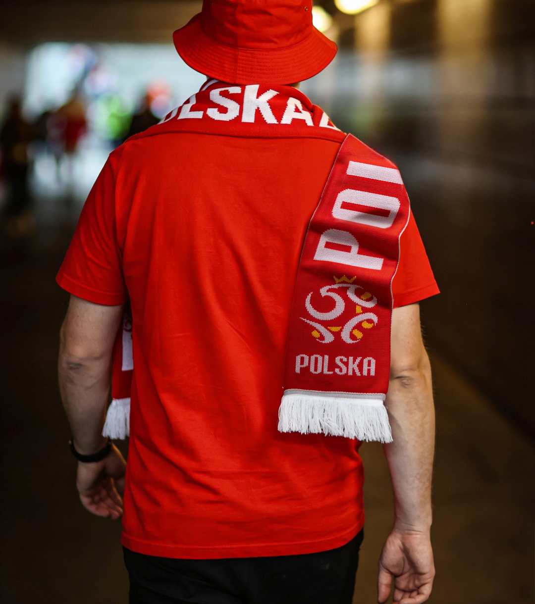
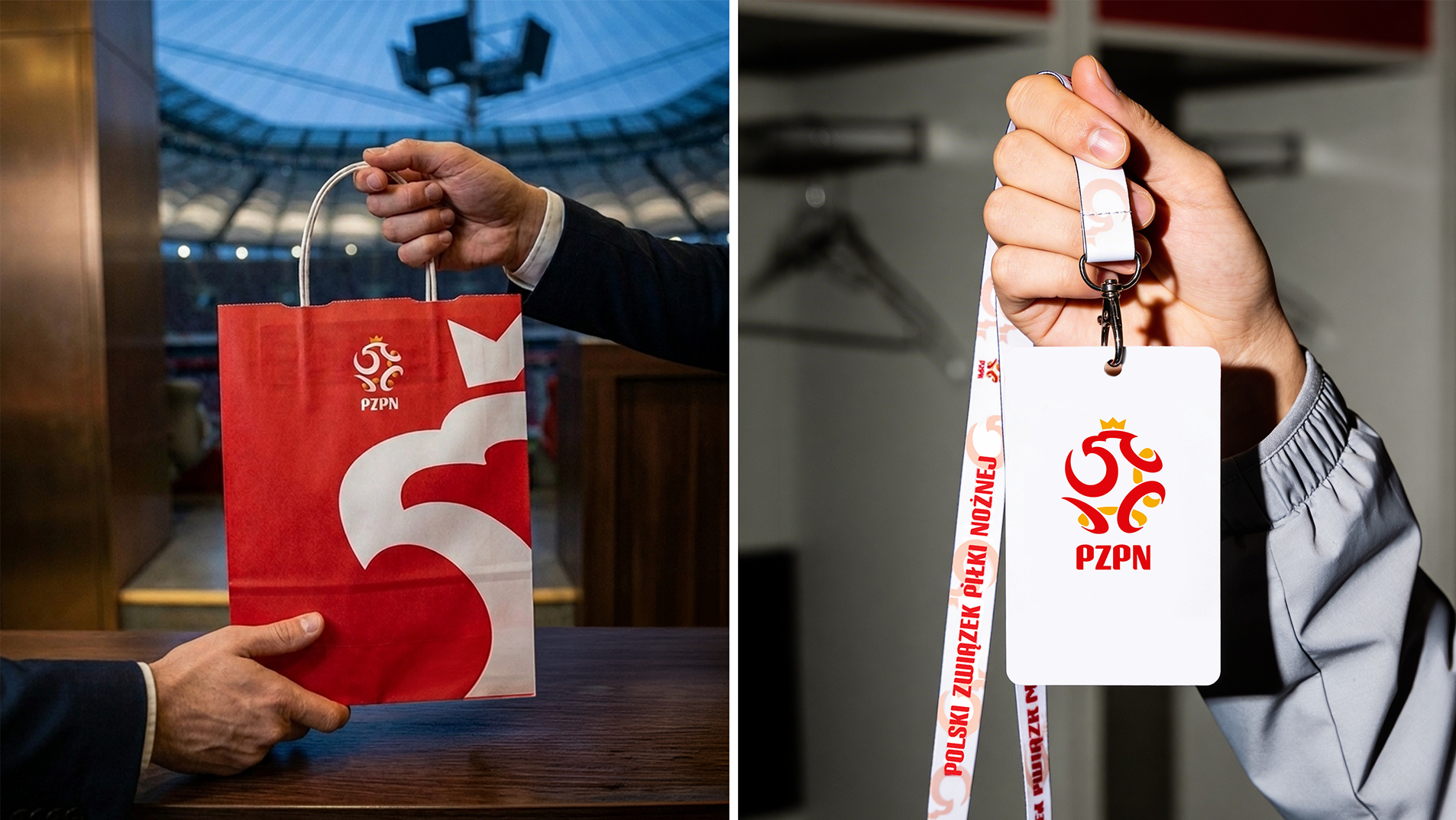
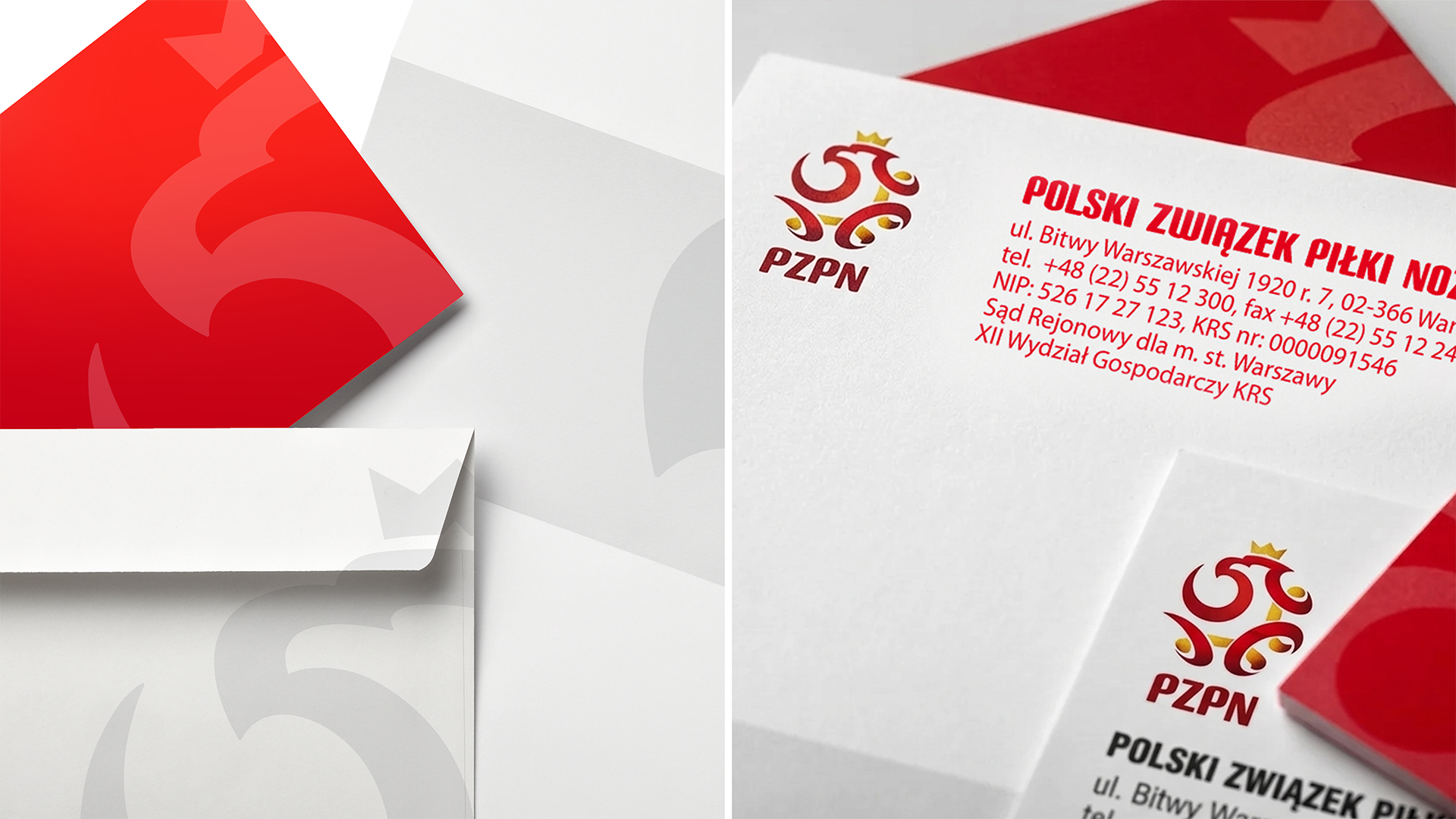
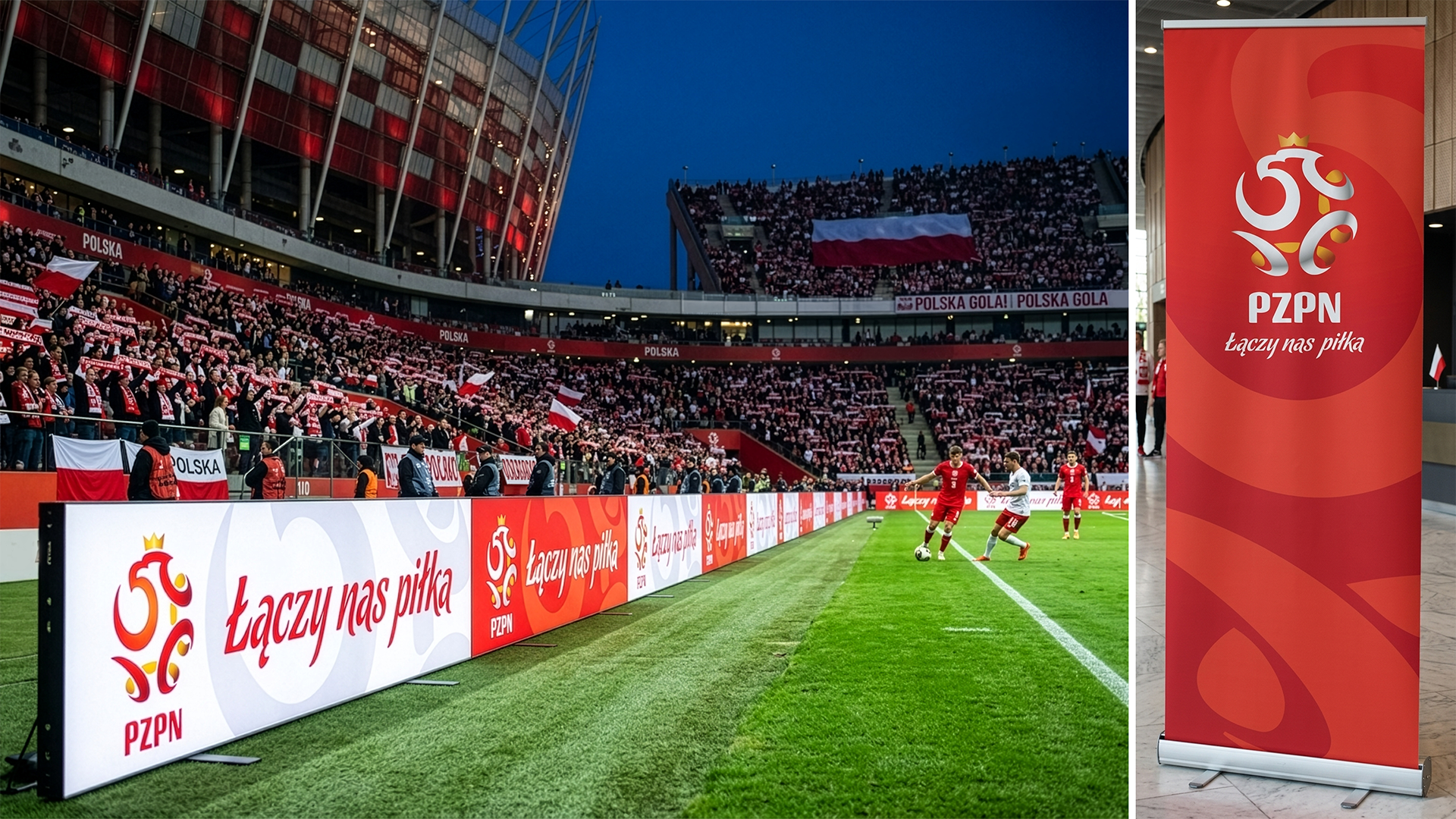
Visualization and presentation work for the existing emblem of Polski Związek Piłki Nożnej — the Polish Football Association. The crowned-eagle mark and PZPN wordmark were provided as a finalized identity; the deliverable was a clean, presentation-grade lockup showing positive and reverse colour applications side by side, as used in brand-guideline contexts.
Identity-guideline mockups live or die on neutrality. The presentation strips away set, props and atmosphere — the only job is to let the mark read at any size, in both its colour environments, with no distraction from the work itself.
The lockup also doubles as a stress test: positive on warm light grey, reverse on the full PZPN red. If the mark holds equally in both, it's cleared for any application across the federation's brand system.
“An identity that already exists. A presentation that earns its quiet.”
| Software | Illustrator · Photoshop |
| Resolution | 3840 × 2160 px |
| Format | Identity presentation board |
| Deliverables | 1 dual-application lockup |
| Source artwork | Provided by PZPN (final identity) |